|
All right, you crazy Wisconsinite, you. It's time to trim your philodendrons or use the cuttings to make new plants. This is ridiculous, bordering on creepy. But maybe it's just me, after reading the scary book The Ruins, I'm not a fan of any kind of ivy taking over anything. 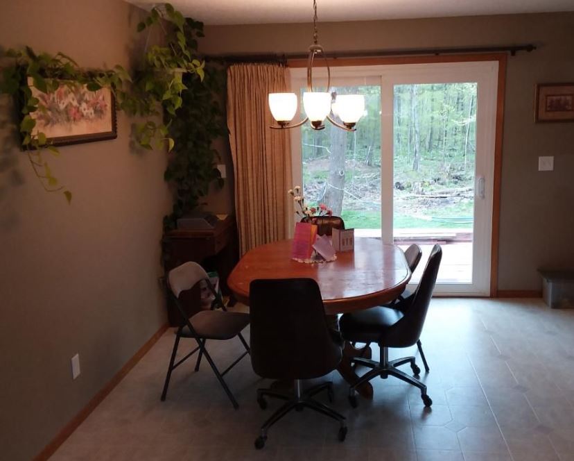 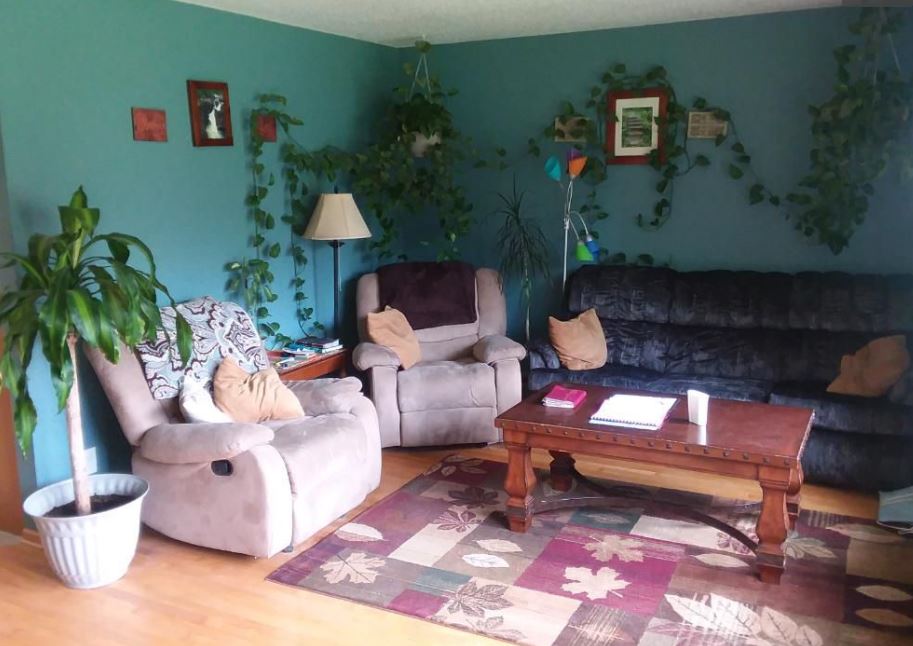
0 Comments
This is just odd. It's not like there is counter space at each window to hold a plate. A drink maybe. But then there's no leg room. I just don't get this.  While there's nothing really wrong with this real estate photo (and, hey, the photographer isn't even in the mirrors!), I really don't like what's going on here. I'm not a fan of sinks that look like bowls sitting on the vanity counter. What's worse, this vanity isn't large enough to warrant two sinks. But I really have an issue with the two oval mirrors. They look like eyes. The space is too small for two sinks and two googly-eyed mirrors. 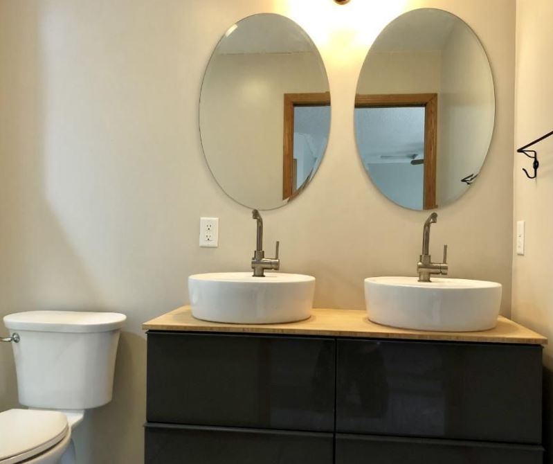 Now you can travel the space-time continuum from your own home in this shower pod, created by NASA. Launch pad sold separately. 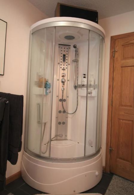 This bathroom could use a shower curtain in it. I don't see one, do you? 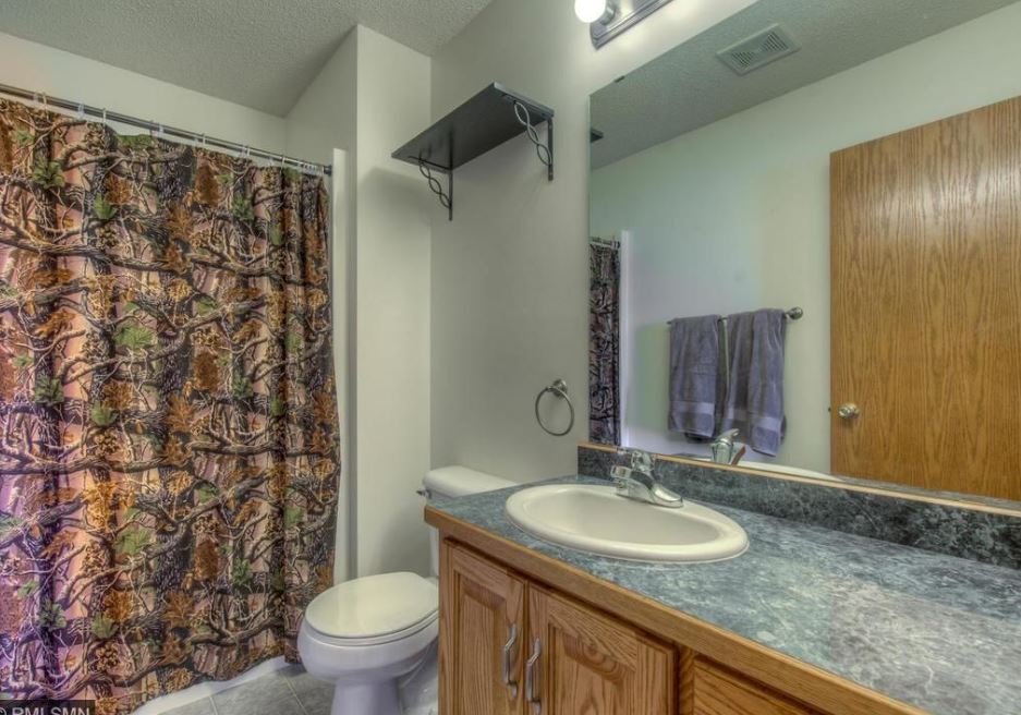 There's nothing horribly wrong with this real estate photo. But, I've seen this style bedspread in multiple homes. I'm not a fan. I wondered why people are drawn to buying it. My suspicion is the pintuck design means less smoothing/neatening is required when making a bed. Just toss it on. 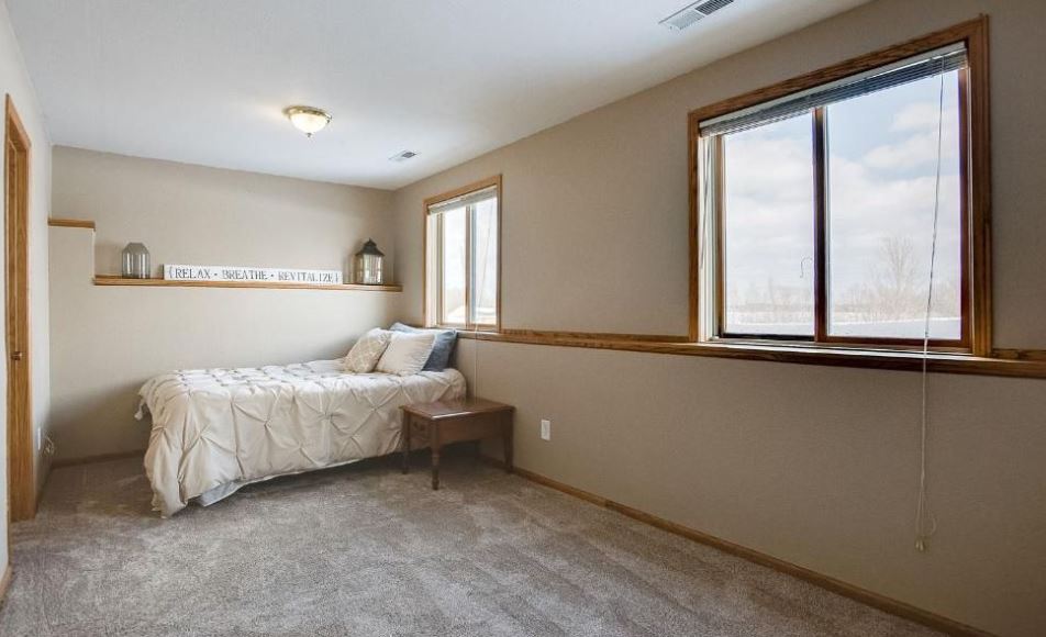 If you want to buy your own pintuck comforter (why?) here's one on Amazon. 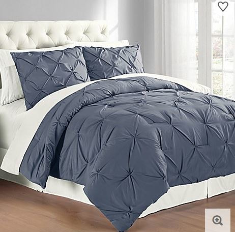 Real estate photos are supposed to entice potential buyers, not repel them. Sometimes the least amount of effort can improve a room. In the following picture I've circled problem areas. All the home owner and/or realtor had to do was remove the items from view. This would have presented the kitchen as clean and uncluttered. 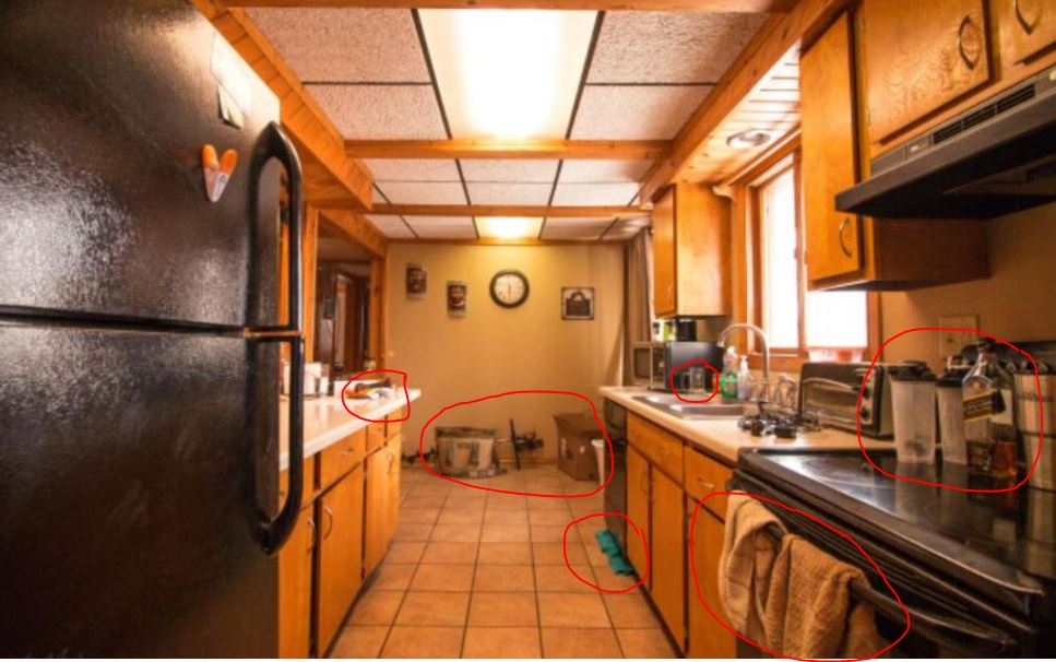 From the other end of the room, more clutter on the counter and a very concerning towel beneath the dishwasher. The only conclusion one can draw is the dishwasher leaks. No thanks! 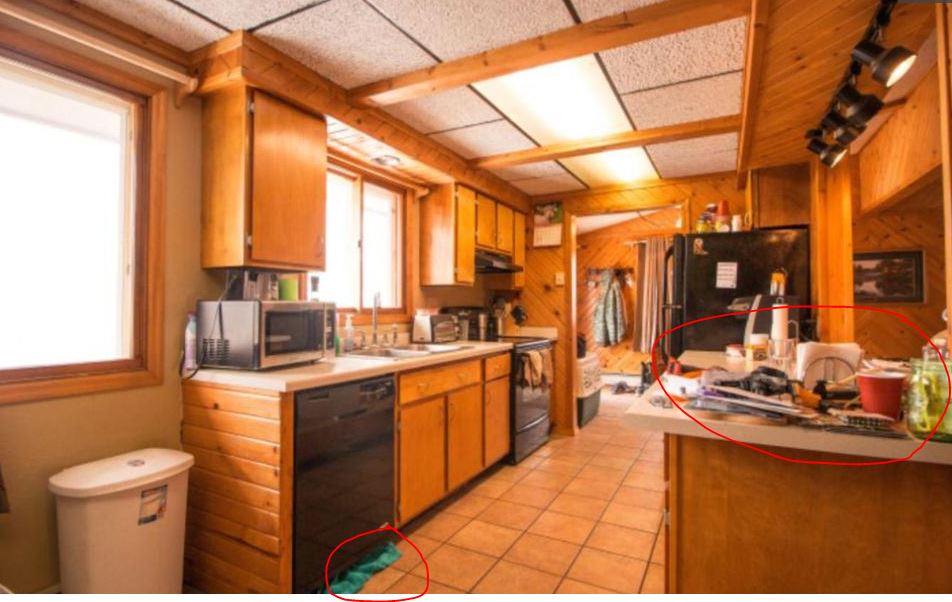 The following three photos are from three different homes. What, pray tell, is the purpose of including this shot of the stairwell in a series of photos for a home? To demonstrate it's too narrow to put a corner shelf on the landing, that's why! And how lazy not to tuck those extension cords out of view. 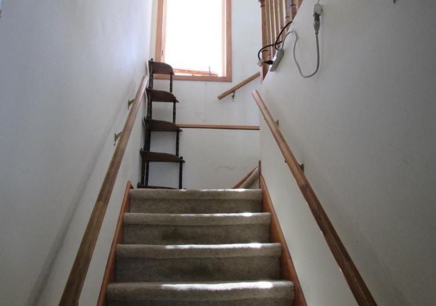 While this looks like a nice kitchen, what is the point of taking the photo from toddler-level? How odd. 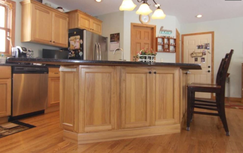 This house was not a log cabin, so I was confused why the owners framed a room with logs. Then I realized it was log cabin wallpaper. WHY?! Why does log cabin wallpaper even EXIST? 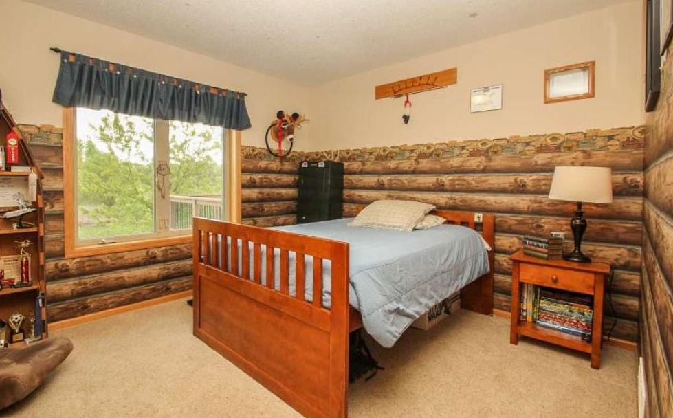 Look, I'm an animal lover. Dogs, cats - I've had both. But when it comes time to sell my house, I'm not going to pose my dog alluringly on my leopard-print bedspread in the real estate photos. That's just exploiting the poor animal. 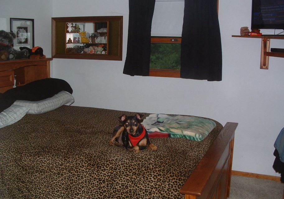 Usually I critique sloppy realtor photos and poor home staging. Then I came across this photo. The windows above the doors serve no purpose and aren't centered at all. It makes no sense. My only guess is perhaps those two rooms do not have exterior windows and these were installed to let in natural light. But then, why not center them? Probably some framework or ducts in the way? Was this a builder design or did the homeowner do their own remodeling? Either way - no. 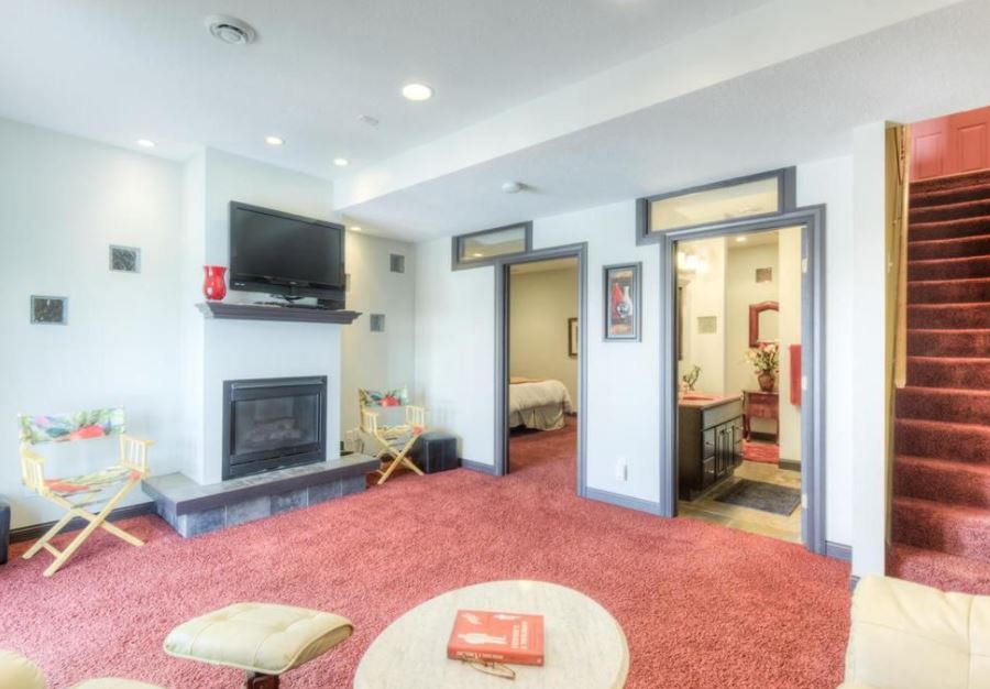 |
About Sally FarleyI'm a typical, hardworking Midwesterner, enduring (and sometimes participating in) the passive-aggressive complexities of life in Minnesota. ArchivesLinksAsk a Manager
The Book Designer Caren Lissner Dad and Buried MemoirMag Moxie-Dude People I Want to Punch in the Throat Sasha Cagen Social Media Just for Writers Swirl and Thread Categories
All
|
 RSS Feed
